Nightmare Restroom
I am all for as many toilets as possible when it comes to public restrooms, but this design takes the cake for the worst designs ever imagined.
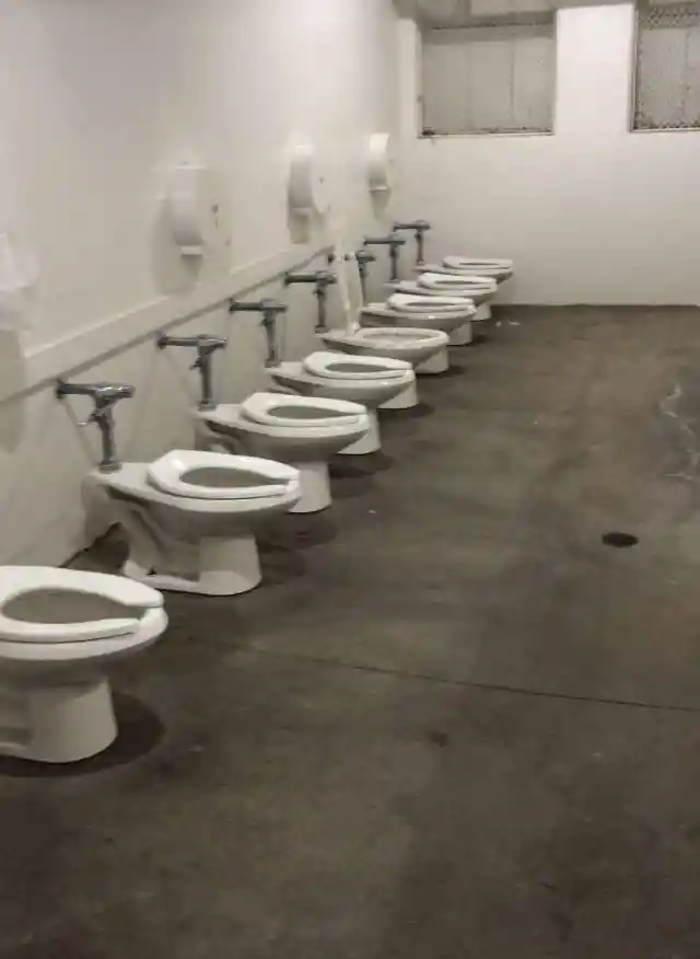
Anyone ever heard of privacy?
Print Placement
When designers are creating prints for their new lines, generally speaking, they think about what the print is going to be made into.
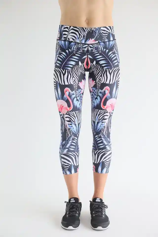

You know, in order to not have situations like this one on their hands. Yikes.
Naughty Bridge
Another prime example of how not thinking about all aspects of the design process i.e. cutting corners, can really bite you in the bum later.
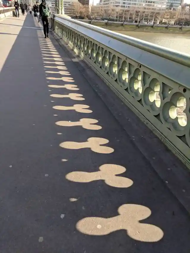
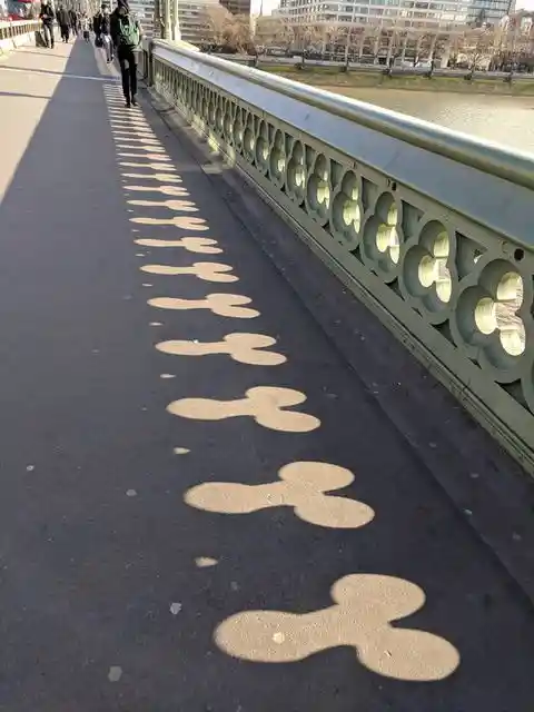
Someone didn’t think about what shadow it was going to create, or did they? Oh and by the way, this is the Westminster bridge.
D.A.R.E Gone Wrong
Okay the concept here isn’t so bad, it’s the execution.
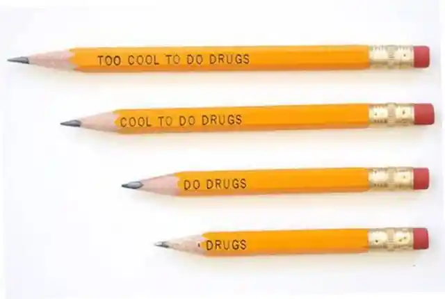
However, it does get funnier the more you use it.
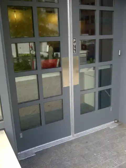
Ironic Sign

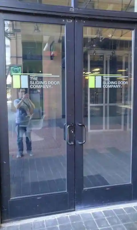
You’d think that they would have thought about their door a little more, especially because they’re a sliding door company.
Shoe Mishap
We get it–you have a lot of shoes. But there is no need for name calling.
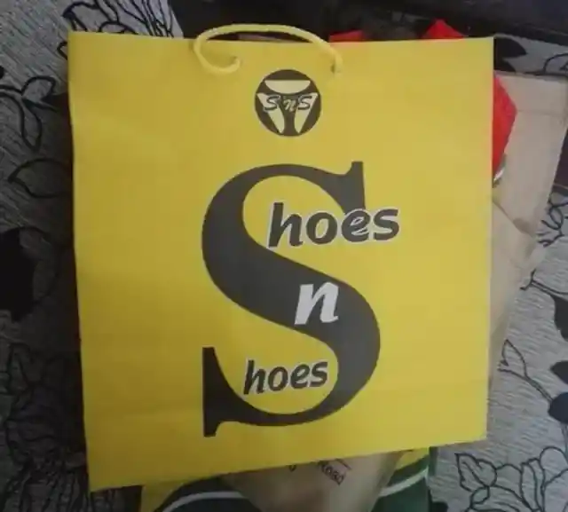

Who knows how this one made it out of the writing room.
No Safety Allowed
I bet whoever painted these signs finished the job, stepped back, and had a moment of panic.

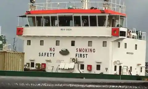
My question is, why hasn’t someone fixed it? It sounds like an SNL take on a D.A.R.E. rule.
Quiz Fail
What’s funny about this design fail is the kid actually got the right answer, it’s whoever designed the quiz that’s at fault.
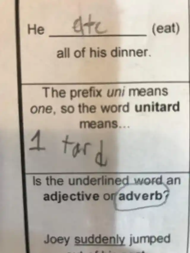
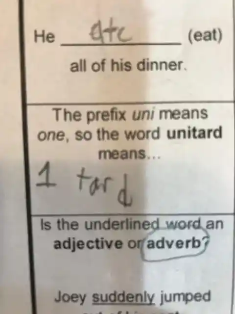
I’m sure everyone involved had a good laugh. I know we did.
Not So Funny
When people have brain farts and create design disasters it’s usually hilarious, but this time, not so much.

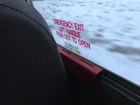
Whoever designed the seating arrangement clearly wasn’t thinking, as they blocked the only emergency exit.
Ad Gone Wrong
Whatever genius decided to pair this image with this script made this company look like idiots.
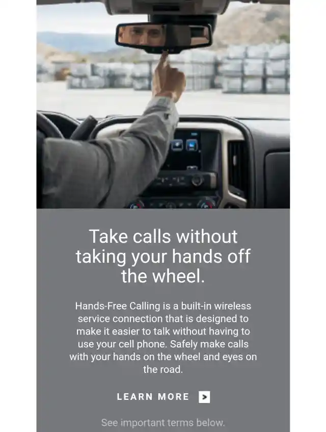
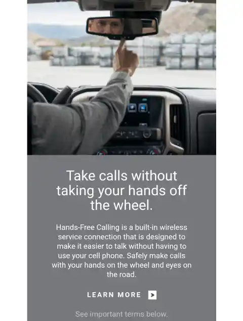
“Hands-Free” calling, yet he’s using his hands…I mean seriously, come on people.
Somewhere In NY
Another prime example of someone designing a logo that didn’t have the qualifications to do so, is this construction company.

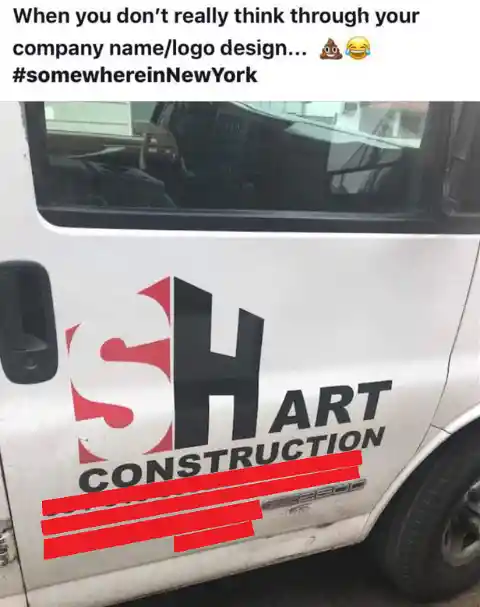
Not to totally call them out or anything, but I wonder if they know it reads as “shart”.
Shampoo Gone Wrong
This kid’s mom bought him strawberry scented Minion shampoo.

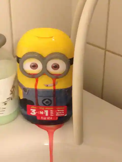
All fun and games until it looks like it wants to murder you when you open the shower curtain.
Great Advice
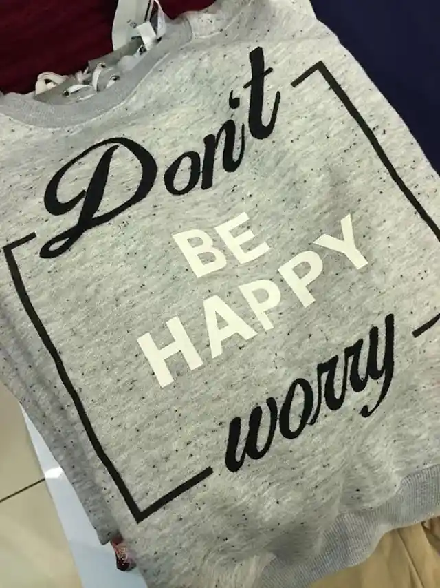
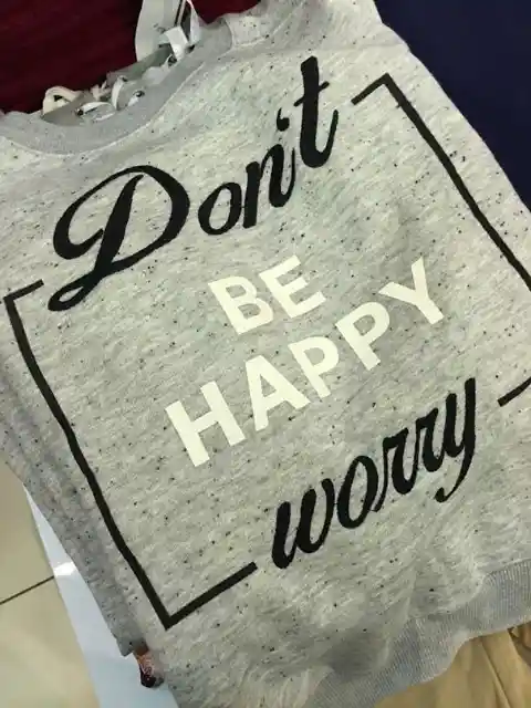
All of these “Don’t Worry…” designs are getting old, especially when they’re giving you bad advice.
Trippy Stairs
I can’t believe no one thought this would cause issues, it’s trippy just to look at let alone walk down.

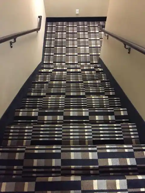
One set of stairs suddenly morphs into four. A drunk person wouldn’t stand a chance.
Poop Slide
It’s one thing to have animal themed parks for kiddos, and it’s another to have them slide out of an elephant's bum.
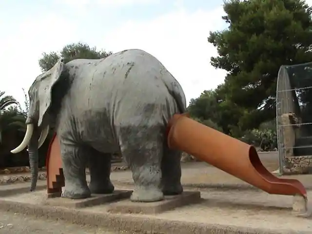

I have a few words.
Jedi Entrance
Whoever made this door clearly didn’t want people to actually get inside.

Of course, unless you’re a Jedi.
Compass Fail
I know we don’t have to use compasses anymore, since we have our phones and all, but you should still know some navigational skills, right?
These were probably on clearance.
Really?
I mean…who really thought that looked like a G?
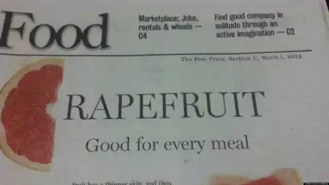
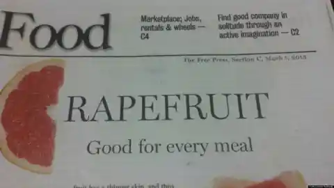
Even if it did, the word RAPEFRUIT still is too alarming to not take over the page. Next time.
Escalator To?
Someone definitely got fired for this one.
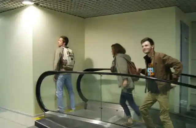
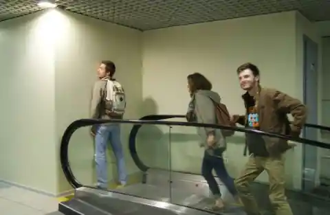
I mean… wow, quite the screw up. Escalator to where exactly?
Dangerous Mix-up
This one doesn’t make sense. Clearly there were two different people working on this project, one on paint and one on the rail. I don’t think they talk much.

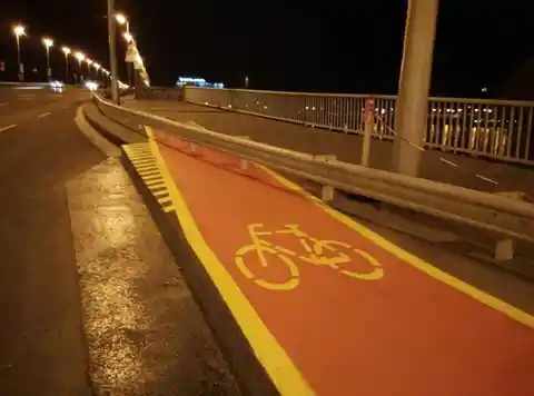
I guess any biker taking this lane has to know some tricks for this crossing.
Bad Patterning
This marble was the wrong choice for this sink, no matter how hard you scrub it, it always looks dirty.
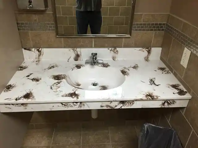

I wonder how many times customers complain about the dirty bathroom. Let’s just hope this isn’t in a restaurant.
Cooking or Killing?
I’m not sure how the same company that kills insects got into making cooking spray, but a little word of advice, change the packaging.
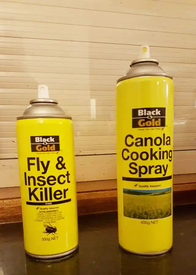
Can you imagine if grandma accidentally grabbed the killer at the backyard BBQ?
Animal What?
You probably couldn’t tell from the sign, but this is a pet store, not whatever you were thinking.
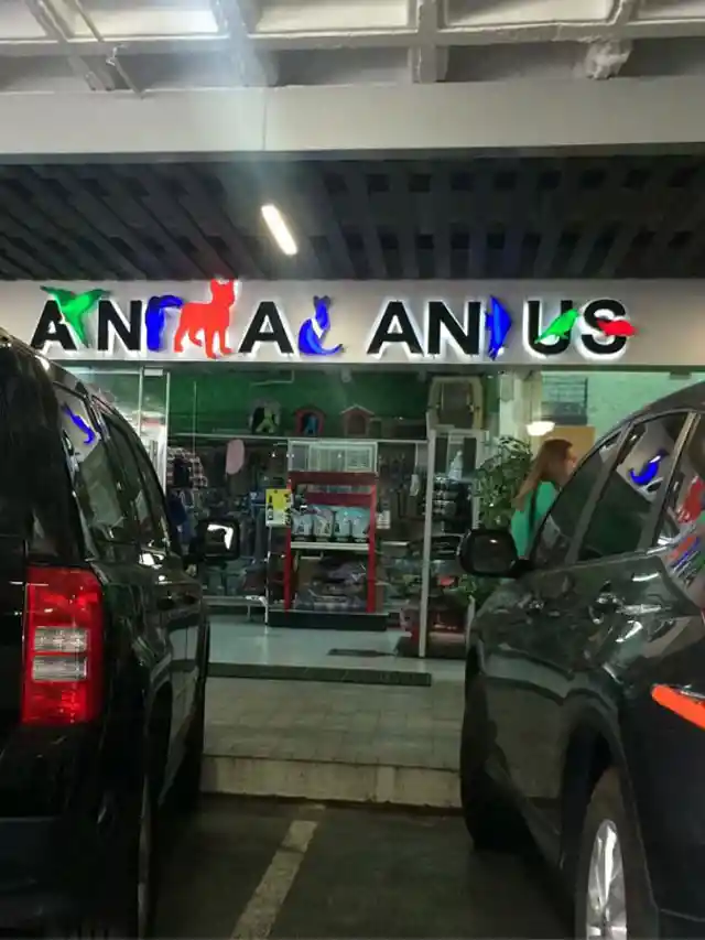
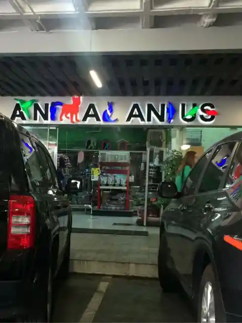
They get an A for creativity, but they have to know how this looks…
Wedding Card Nightmare
This wedding card is supposed to be congratulatory towards a new bride and groom, but instead it looks like they’ve hung themselves.

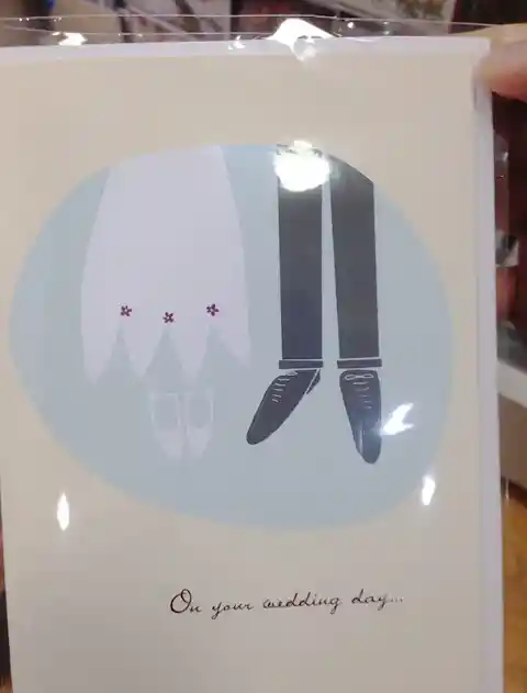
Not such a Hallmark moment.
Camo Gold-Ball
Camo may be in fashion, but what are you going to do when you actually use the ball, and can’t find it?
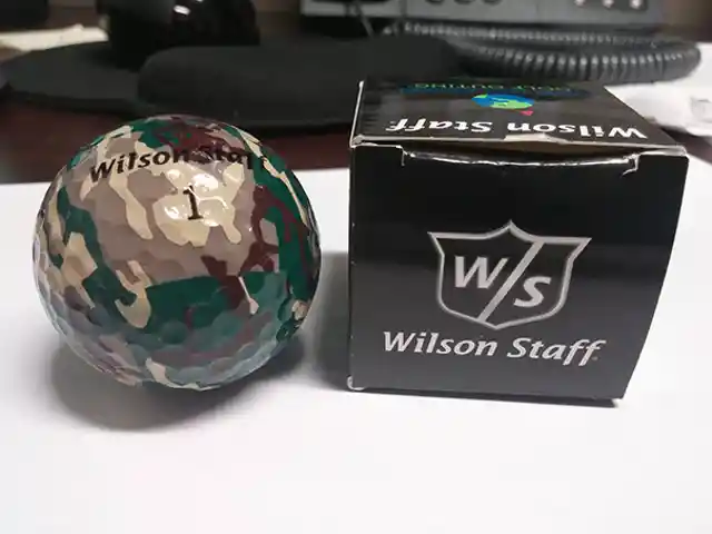
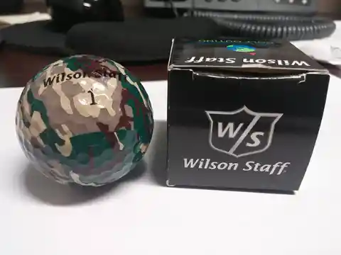
Nice try Wilson.
Fail or Win?
Although this isn’t the best look for Yves Levesque, it’s hysterical.
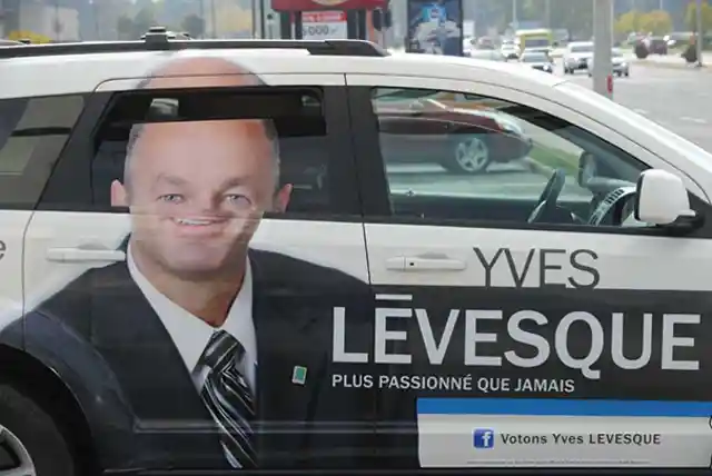

We’re not even sure if this is a fail.
Language Mishap
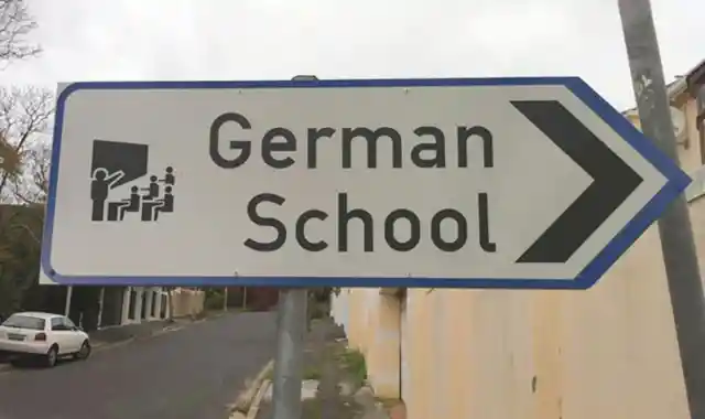

Something feels wrong here, I feel like this sign should be in German, you know, just in case?
Poo Professor
This designer was trying to something cool with the lettering here, but combine with the image, it looks like it’s meant to say something else.
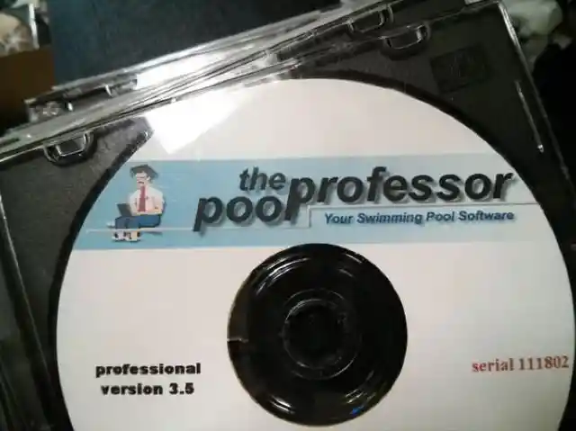

His feet are in the water, but he looks like he’s on the poo’er…
Elevator Madness
Imagine being late for work and getting on this elevator.

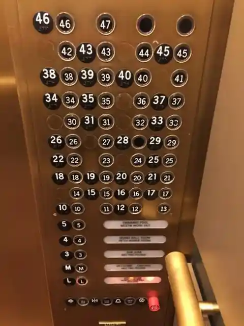
The pure definition of chaos.
Balloon Nightmare

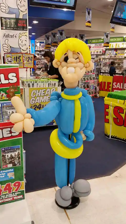
Nice try, but this balloon man looks more like a monster.